Google Summer of Code Progress August 19
So we are at the end of this awesome summer and this post is about the progress in my final weeks of GSOC 2016! And the major addition in this period is the development stats visualization page.
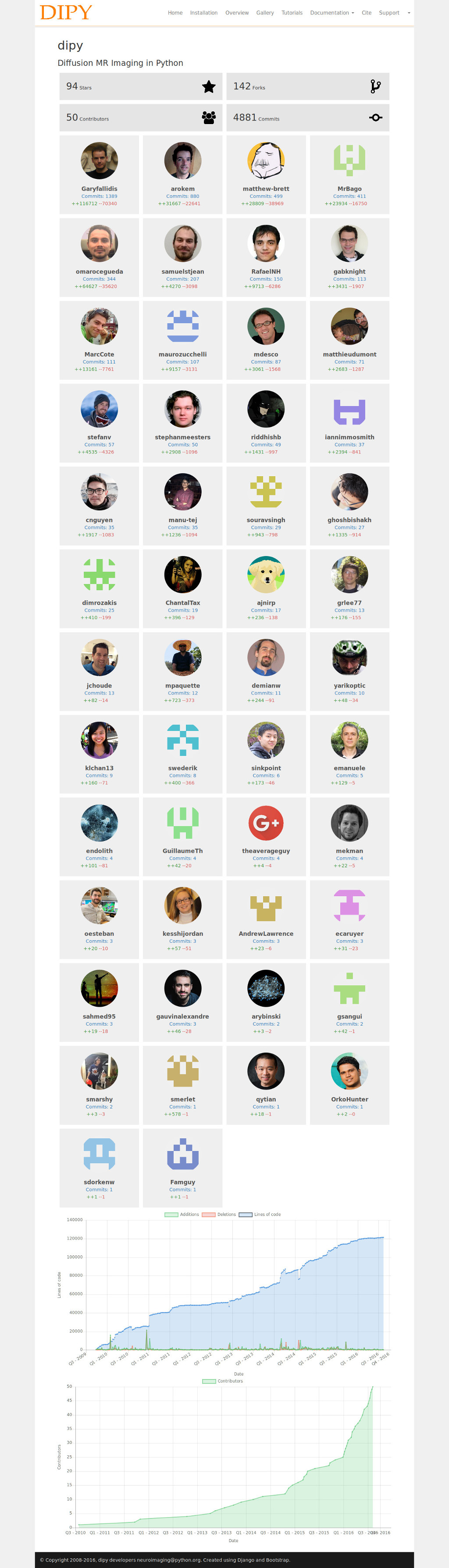
GitHub stats visualization
As we had planned, the new Dipy website needed a page to highlight the growing number of developers and their contributions to the Dipy project. And finally we have achieved that with a separate django app that creates visualizations with data pulled from GitHub API, and for drawing some neat graphs I have used the Chart.js library.
And hey its a separate django app!
So it can be integrated easily into any other django project! Simply copy the github_visualization folder into your project and add github_visualization to the INSTALLED_APPS list in settings.py.
Now you just need to add a couple of lines to the template in which you want to show the visualizations.
<!-- load the template tags for github_visualization -->
{% load github_stats_tags %}

<!-- load css and js -->
{% include "github_visualization/github_stats_includes.html" %}

<!-- render the visualizations -->
{% github_stats_block "username" "repository_name" %}
Just change the ‘username’ and ‘repository_name’ to point to the GitHub repository you want to see visualizations for.
The work was submitted throught the pull request #15.
Posted with Tags: